Page 1 of 1
Great looking on screen text, studying successful art styles
Posted: Sat Feb 11, 2012 8:00 pm
by EdBoon
Recently I have been paying a lot of attention to in-game onscreen text in many AAA games to understand what is behind creating text on screen that looks great. When developing my own stuff, I have always felt the on screen text has been a weak point of my game's presentation. It just looks incredibly flat and boring, unprofessional really. I am not the greatest graphic designer or artist (probably closer to one of the worst) but I'm looking for maybe some hints/tips/anatomy behind making it fit right into the game's environment.
Looking at some games that i feel have great screen text, first I thought there was something about having a glow or border around the text that made it pop or fit right while being placed ontop of the environment, for example:

In this screen from split second, it just seems to fit. Looks great here, doesn't really look like it is just plastered onto the screen over the 3d rendering, it feels more like it is in the game and not ON the screen. I know that the blue meter helps the illusion that it is actually in the game but even without it i think it would look great. It seems here that there is a bit of glow to the letters, maybe that helps.
another example:

in this final fantasy screen, it is very simple, and has a shadow + black border on the letters, but still looks good in my opinion.
After seeing a lot of screens like this I thought the text needed some sort of glow/gradient/shadow etc.. but then you have your fps that usually have none of these. Halo Reach for example:

Here we have solid color, non-effects text and still manages to look good on screen. Doesn't have the ameture feel that throwing arial black font has that is so familiar to many indie games, yet it is just as simple.
Each game I go through I try to improve on things I thought my last game lacked, and this is definitely one of the subjects I have failed.
If anyone has any pointers, hints, suggestions/guidelines that they use when using on screen text, please I would greatly benefit from any experience you have. Also if you know of games that the in-game text is fantastic, leave your thoughts here and let others learn from the better examples out there already in games.
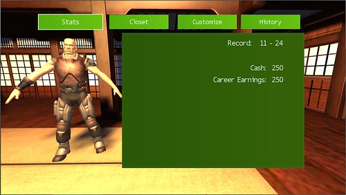
And here I will leave below a screen from my project that I just hate:
Re: Great looking on screen text, studying successful art st
Posted: Sat Feb 11, 2012 8:12 pm
by dandymcgee
The biggest difference I immediately notice that makes your text looks worse than theirs, your font isn't heavy enough. Bold it, see what happens.
Re: Great looking on screen text, studying successful art st
Posted: Sat Feb 11, 2012 8:23 pm
by EdBoon
dandymcgee wrote:The biggest difference I immediately notice that makes your text looks worse than theirs, your font isn't heavy enough. Bold it, see what happens.
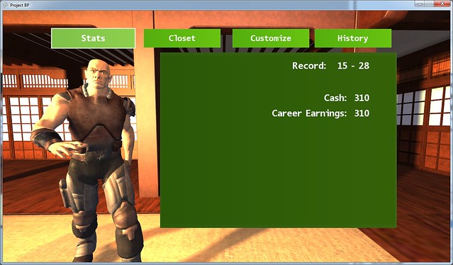
That does add a bit of sharpness to the font
Also to point out the large green box won't be there, it only defines the area I have to work with putting stats.
Re: Great looking on screen text, studying successful art st
Posted: Sat Feb 11, 2012 8:39 pm
by dandymcgee
EdBoon wrote:
That does add a bit of sharpness to the font
Also to point out the large green box won't be there, it only defines the area I have to work with putting stats.
That looks much better on the buttons. For the stats, if they will be displayed directly on the background, you may want to add an outline. The first two screenshots you posted outlined their text with another color. In any case, you may be able to find a color other than pure white that still contrasts well with the surrounding graphics. Sometimes this is possible, sometimes not.
Re: Great looking on screen text, studying successful art st
Posted: Sat Feb 11, 2012 8:43 pm
by EdBoon
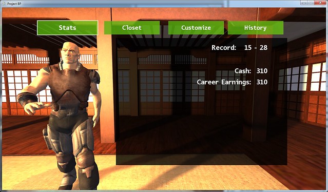
Yea I don't think the green is the best choice here, the surroundings have such an orange light to them maybe something that would go better with an orange color, like a blue.
I also noticed in other games when they did have a background box it usually has transparency so I added that, it helps a little
Re: Great looking on screen text, studying successful art st
Posted: Sat Feb 11, 2012 10:57 pm
by ibly31
In the cases of the examples you posted above, I think a lot of the illusion of being IN the screen has to do with the camera shake. I noticed that a lot of games like Battlefield, Split Second, Halo:Reach all make the text follow the head bobbing and really feel as if they are plastered onto a HUD of the soldier.
However, for your example, the GUI makes it very clear that this is a 2D information screen and that it is not attempting to flow with the scenery or make it feel as if its IN the scene. And this is okay because you aren't trying to make it be anything else. I think the best thing you can do for this game is bold it like dandymcgee mentioned and just experiment with different styles. For any heads up stuff during the actual game, I think it would be a cool experiment to see if you can counteract any camera movement and make it appear as if the text is floating inside the game to get a better effect.
Re: Great looking on screen text, studying successful art st
Posted: Sun Feb 12, 2012 9:16 am
by EdBoon
ibly31 wrote:In the cases of the examples you posted above, I think a lot of the illusion of being IN the screen has to do with the camera shake. I noticed that a lot of games like Battlefield, Split Second, Halo:Reach all make the text follow the head bobbing and really feel as if they are plastered onto a HUD of the soldier.
However, for your example, the GUI makes it very clear that this is a 2D information screen and that it is not attempting to flow with the scenery or make it feel as if its IN the scene. And this is okay because you aren't trying to make it be anything else. I think the best thing you can do for this game is bold it like dandymcgee mentioned and just experiment with different styles. For any heads up stuff during the actual game, I think it would be a cool experiment to see if you can counteract any camera movement and make it appear as if the text is floating inside the game to get a better effect.
That's a great observation about the camera movement, another thing to think about for me. Now that you mention it, saints row 3 had some kick ass menus (along with kick ass EVERYTHING else) that had sort of a counteract in the text with the camera movement. Thanks for your input.
Also if anyone else is curious about this topic as I am, I have received tons of feedback in a reddit post discussing the same thing:
http://www.reddit.com/r/gamedev/comment ... uccessful/
updated a bit more:

Re: Great looking on screen text, studying successful art st
Posted: Sun Feb 12, 2012 2:35 pm
by superLED
It has also something to do with the font. You have to pick a font that fits the style of your game. And choose the right color as well.
Using a childish pink font on an FPS game doesn't do it. I'd like to use a sharp and bold font (no roundish corners and such), with maybe blue or green colors (if it fits the rest)
And the reason a lot of games have borders and such around the font, is because if a blue font was written over a blue area (like the sea), you would have a hard time notice/read it.
With a border, you will be able to read the text no matter what lies behind it. If the background is blue, you could still read it, because it had a black(?) border.
Look up Typography.
Re: Great looking on screen text, studying successful art st
Posted: Tue Feb 14, 2012 7:21 am
by Van-B
It looks a lot better than it did, perfectly clear and bright to me. One thing is though that you might be better off using a bitmap font, that way you can add a drop shadow, anti-alias etc. Also - bitmap fonts give you the chance to add custom characters, like tick boxes and scroll arrows if you need them - can save a lot of messing around when you can just use a character to show a gui element.
Re: Great looking on screen text, studying successful art st
Posted: Tue Feb 14, 2012 7:51 am
by EdBoon
Van-B wrote:It looks a lot better than it did, perfectly clear and bright to me. One thing is though that you might be better off using a bitmap font, that way you can add a drop shadow, anti-alias etc. Also - bitmap fonts give you the chance to add custom characters, like tick boxes and scroll arrows if you need them - can save a lot of messing around when you can just use a character to show a gui element.
Thanks for the input. I think your right, going to bitmap font is the way to go. I found a bitmap font maker for xna and should do exactly what I need.
Re: Great looking on screen text, studying successful art st
Posted: Mon Mar 19, 2012 2:19 am
by Soma
Don't focus so much on video games for inspiration. This is just general graphic design stuff. Get an image editor, like Photoshop or Gimp, and work on mock-up menus. Or some other sort of software for creating wireframes. Wireframes are basically just outlines of a layout. Something like this:

Before messing about with colors, borders, bitmap fonts and all the eye-candy, you need to work on the layout. Everything should be meticulously planned out so you don't end up with tons of extra space or a bunch of jumped crammed into a little box.