Forum for the creative side of the game development process: art, music, storyline, gameplay, concepts, etc. Any sort of relevant discussion is welcome here.
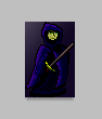
It's been like 4 years since I've done any actual pixel art, so I thought I'd give it a go, and this is what I came up with, no tutorials or copying or anything like that:
(image just gyazo'd from photoshop)
It's pretty terrible, but I guess it's a start and shows me how much I've forgotten over the years :P.
any tips on how i could make something like this more natural? or just CC in general!
I'll also take a look at some of the tuts posted here
I think your using too many shades, and making too many assumptions about lighting. It does look pretty good, but in that 1995 style. I think that if you limited yourself to a maximum of 5 shades of each colour, and considered the shape of the cloak more with lighting it would look better. For the lighting, I would start with a flat, dark blue, but not your darkest shade, then draw in the basic shadows, then add some creases here and there. Then use a lighter shade to continue the creases, try to make the lighter shade cover all the areas that would be lit, then the remaining 2 shades to highlight the creases. Avoid having your highlight at the far edge, try and bring that down closer to the middle, to improve the illusion of depth. Right now it's as if the light source is on the same depth as the sprite, imagine it being more in front of the sprite.
It can be difficult to fathom sprite shading, because you might be dealing with very small sprites, getting good lighting at that scale is tricky. I would suggest looking at comic book artwork, they tend to have really nice lighting, and it's usually a little exagherated, just the right look for sprites I think. If your drawing an animated sprite, I would suggest only drawing in the 3 darkest shades, because then your changing the creases and folds more than anything else, and that gives good results - draw the frames, then add the 2 light shades once your happy. I think it's good to work in the 2nd and 3rd darkest shades, assigned to your left and right mouse buttons, then it encourages you to animate the folds and stuff.
Ah that was some great advice Van-B, thank you!
I never thought of imaging the light source as actually in front of the sprite, as I tend to think in 2d when drawing in 2d, if you get me >.<
and you're absolutely right about the over use of shades too, I'll remedy that on my next attempt .